10.1 Spectral analysis
Fourier series
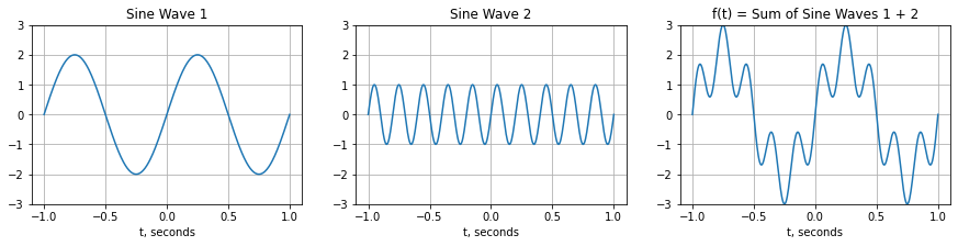
Sinusoidal wave functions can be added together to makes waves with different properties:
import numpy as np
import matplotlib.pyplot as plt

L = 1 # time interval, 1 second
t = np.linspace(-L,L,400) # time, sampled 200 times per second

# Sine wave 1
amp1 = 2
k1 = 1 # number of cycles/second
sin1=amp1*np.sin(2*np.pi*k1*t/L)

# Sine wave 2
amp2 = 1
k2 = 5 # number of cycles/second
sin2=amp2*np.sin(2*np.pi*k2*t/L)

# f(t)
f = sin1 + sin2

#Plot
plt.figure(figsize=(15,3))
plt.subplot(1,3,1)
plt.plot(t,sin1)
plt.ylim([-3, 3])
plt.grid()
plt.xlabel('t, seconds')
plt.title('Sine Wave 1')
plt.subplot(1,3,2)
plt.plot(t,sin2)
plt.ylim([-3, 3])
plt.grid()
plt.xlabel('t, seconds')
plt.title('Sine Wave 2')
plt.subplot(1,3,3)
plt.plot(t,f)
plt.ylim([-3, 3])
plt.grid()
plt.xlabel('t, seconds')
plt.title('f(t) = Sum of Sine Waves 1 + 2')
plt.show()
Any periodic function \(f(t)\) can be represented as the sum of a series of sines and cosines (the Fourier Series):
Where \(a_k\) and \(b_k\) are the Fourier coefficients and control the amplitude of the sinusoidal wave, \(-L\) to \(L\) is the domain of the periodic function, \(k\) is the index of the sinusoidal wave, and \(\frac{k \pi}{L}\) gives the angular frequency of each wave. Each \(k\)th-wave has a different amplitude and frequency, higher \(k\) waves have higher frequency. For example, “Sine Wave 1” in the coded example above has a larger amplitude and “Sine Wave 2” has a higher frequency.
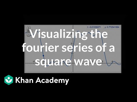
Watch these videos from Khan Academy:

![]()
.gif from Wikipedia illustrating a Fourier Series representation of a square wave function. The function (red, S(x)) is the sum of 6 sine functions with different amplitudes and frequencies. The Fourier transform (blue spikes, S(f)) shows the amplitude of the 6 frequencies.
Fourier transform and power spectum
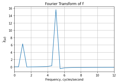
You can represent data as a series in time (in the time-domain) as we have been doing OR you can represent the data in terms of frequency (frequency-domain). This is called a Fourier transform and is illustrated in the .gif above.
The Fourier series is:
with the coefficients are given by:
This is the discrete Fourier series, i.e. a discrete number of \(k\) frequencies \(\left ( \omega_k = k\pi/L \right )\) are used to represent \(f(t)\). By taking the the limits \(L \rightarrow \infty\) and \(\Delta \omega \rightarrow\) 0, the discrete frequencies become continuous \(\left ( \omega = k\pi/L \right )\). Making the Fourier series continuous results in:
These two integrals are the Fourier transform pair and describe how we can move betweem time-domain and frequency-domain.
To compute a Fourier transform we will use the fast Fourier transform (fft). We will use the scipy.fft package, specifically fft to compute the Fourier transform, fftfreq to compute the frequencies, and fftshift to put the coefficients in the right order. The fft algorithm is fast because it groups the odd and even Fourier coefficients, so they will be in a non-numerical order.
from scipy.fft import fft, fftfreq, fftshift

FT_f = fft(f)
freq = fftfreq(400, 1/200)

plt.plot(fftshift(freq), fftshift(FT_f))
plt.title('Fourier Transform of f')
plt.xlabel('Frequency, cycles/second')
plt.ylabel('$\hat{f}(\omega)$')
plt.xlim([0, 12])
plt.grid()
plt.show()
/opt/anaconda3/lib/python3.7/site-packages/numpy/core/_asarray.py:85: ComplexWarning: Casting complex values to real discards the imaginary part
  return array(a, dtype, copy=False, order=order)
Another useful way of visualizing the frequenecy content of our time-series data is to plot the power in the data as a function of frequency. This is known as the power spectrum.
There are entire courses devoted to the subject of time series analysis and a complete treatment is beyond the scope of this class, but we can begin to answer the basic question: Do the two data sets have wiggles with the same frequencies?
To compute the power spectral density for a time series we will use the signal.periodogram function in the scipy package. As a result we will be able to generate a periodogram, which is a plot of power versus frequency.
We will also use a window in the periodogram calculation. What a window does is multiply the time series by a function (called a taper) that weights information, suppressing data at the edges of the window and focussing on the center of the window. The simplest window is a box car which gives equal weight to everything inside the window. In the following, we will use a Hann window which looks more like a bell curve. You can check it out here: https://en.wikipedia.org/wiki/Window_function
from scipy import signal

freqs,power = signal.periodogram(f,fs=200,window='hann')

plt.plot(freqs,power,linewidth=2)
plt.title('Periodogram')
plt.xlabel('Frequency, cycles/second')
plt.ylabel('Power')
plt.grid()
plt.xlim([0, 12])
plt.text(1.3,2.5,'Sine Wave 1')
plt.text(5.3,0.75,'Sine Wave 2')
plt.show()
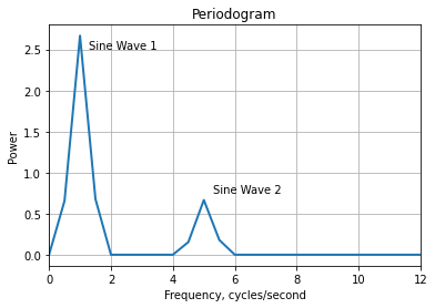
Peaks in the power spectrum show the fundamental frequencies present in your signal.